A people-first approach to recruitment
Highly bespoke brand identity for relationship lawyers
A people-first approach to recruitment
Scope of work Brand Identity
Scope of Work Brand Identity

In many European countries, companies face a growing shortage of workers.
The Challenge
Recruitment agencies play a key role in solving this. Work Time stands out by offering end-to-end support — from hiring to helping new employees settle in a different country. Their coordinators stay hands-on, focusing on great service for both clients and candidates. But the company had outgrown its old logo and lacked a consistent system for brand materials.
The Approach
We started by defining the brand positioning around human support and movement — Work Time as a bridge between people and opportunity. The design had to reflect a team that is energetic, trustworthy, and action-oriented. We focused on building a visual system that felt dynamic yet structured, adaptable to both digital and print use.
The Solution
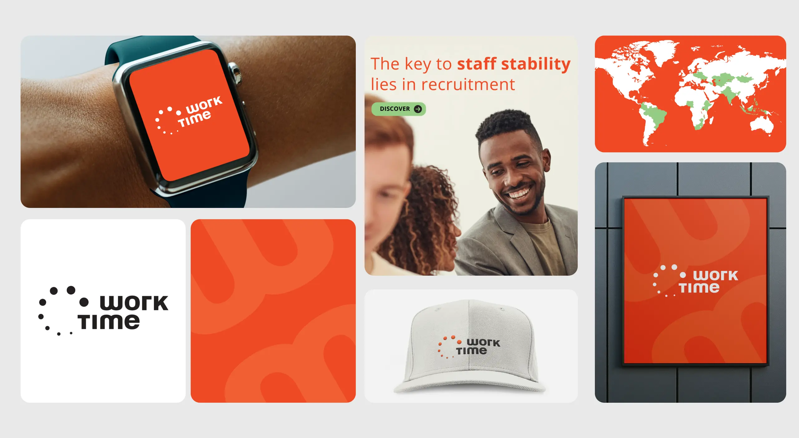
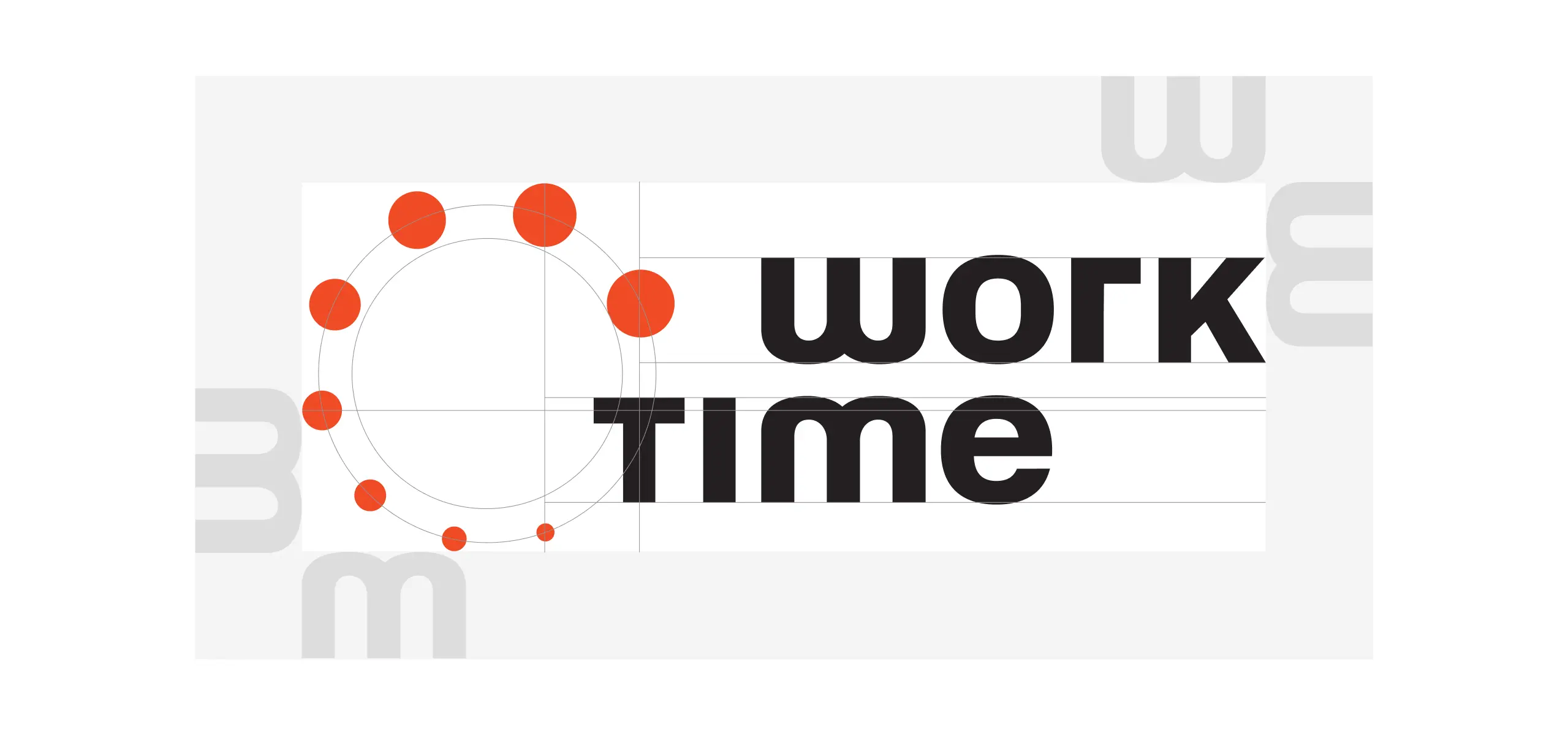
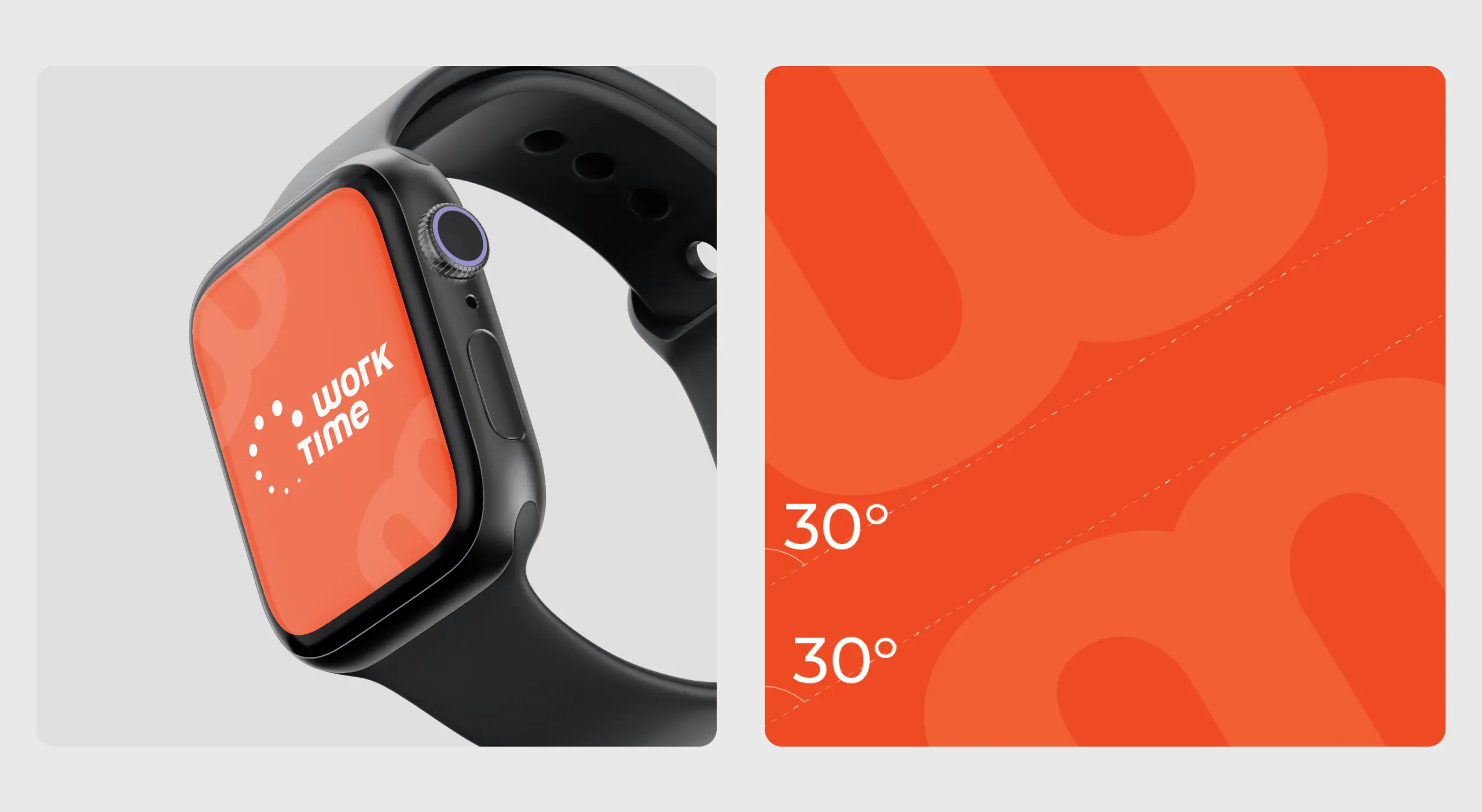
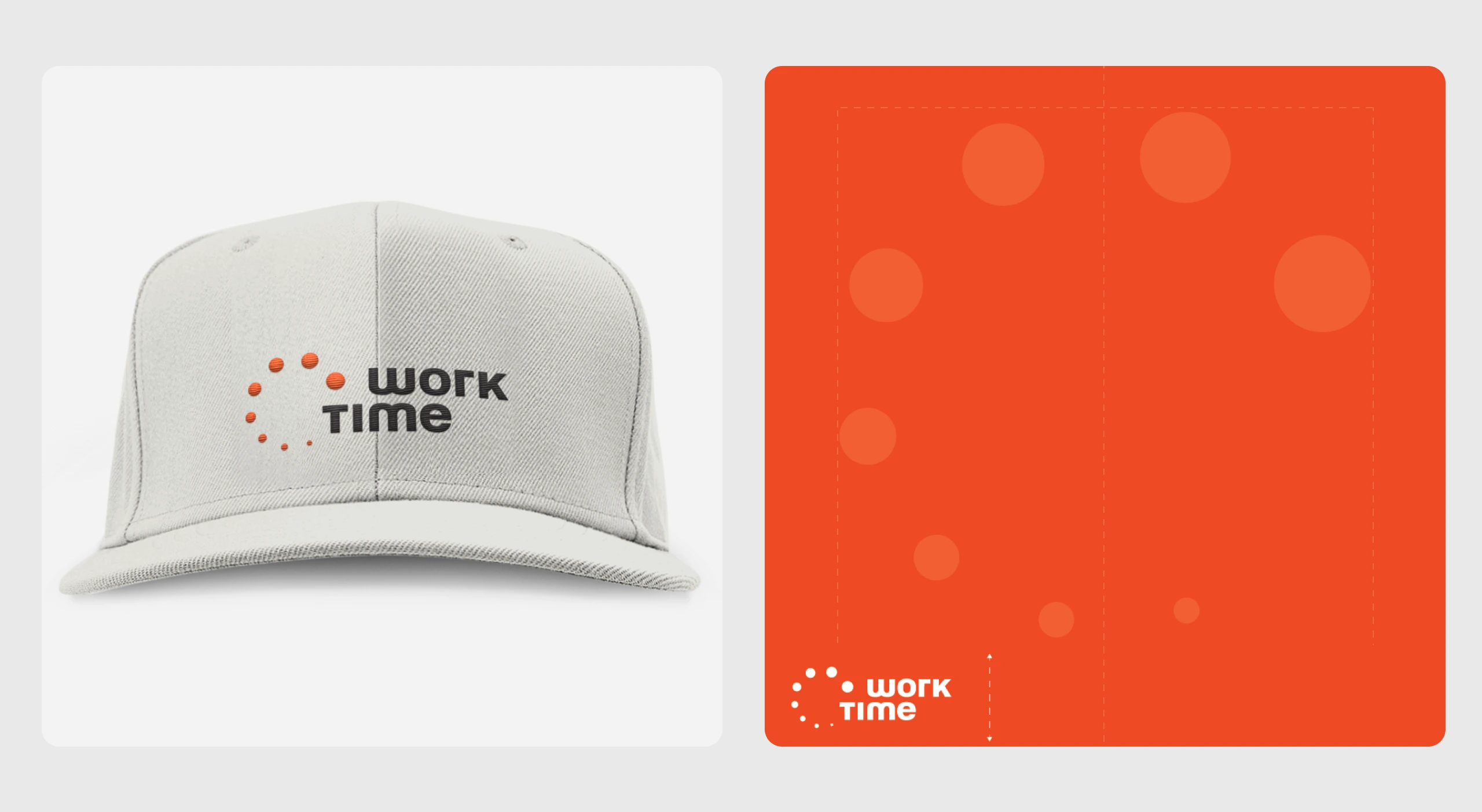
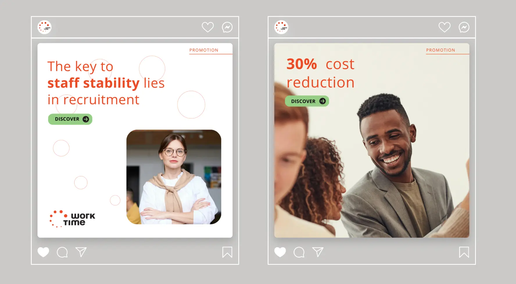
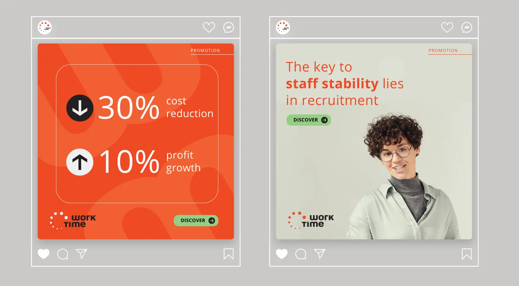
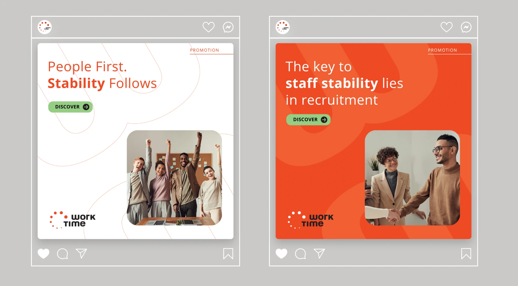
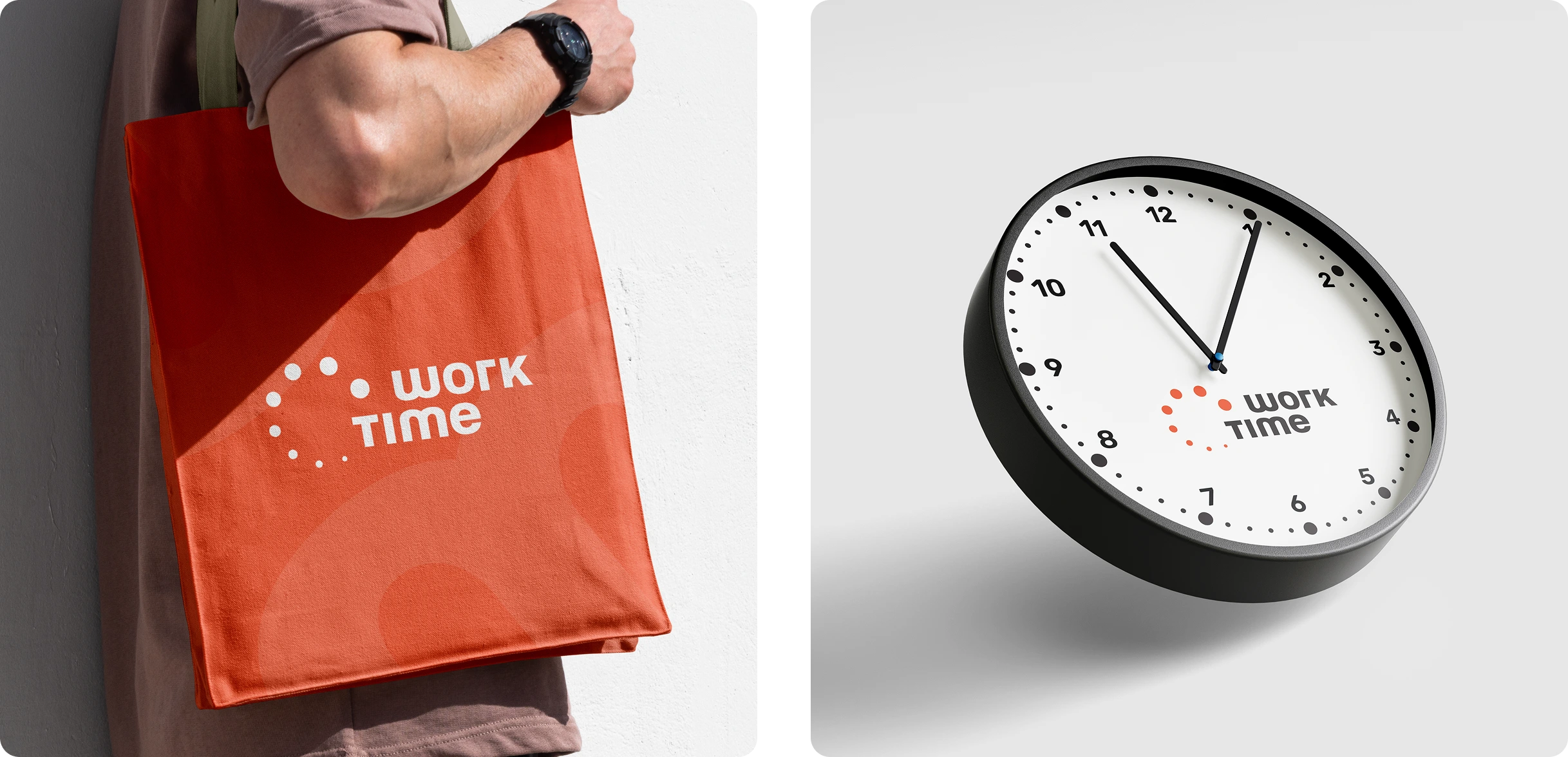
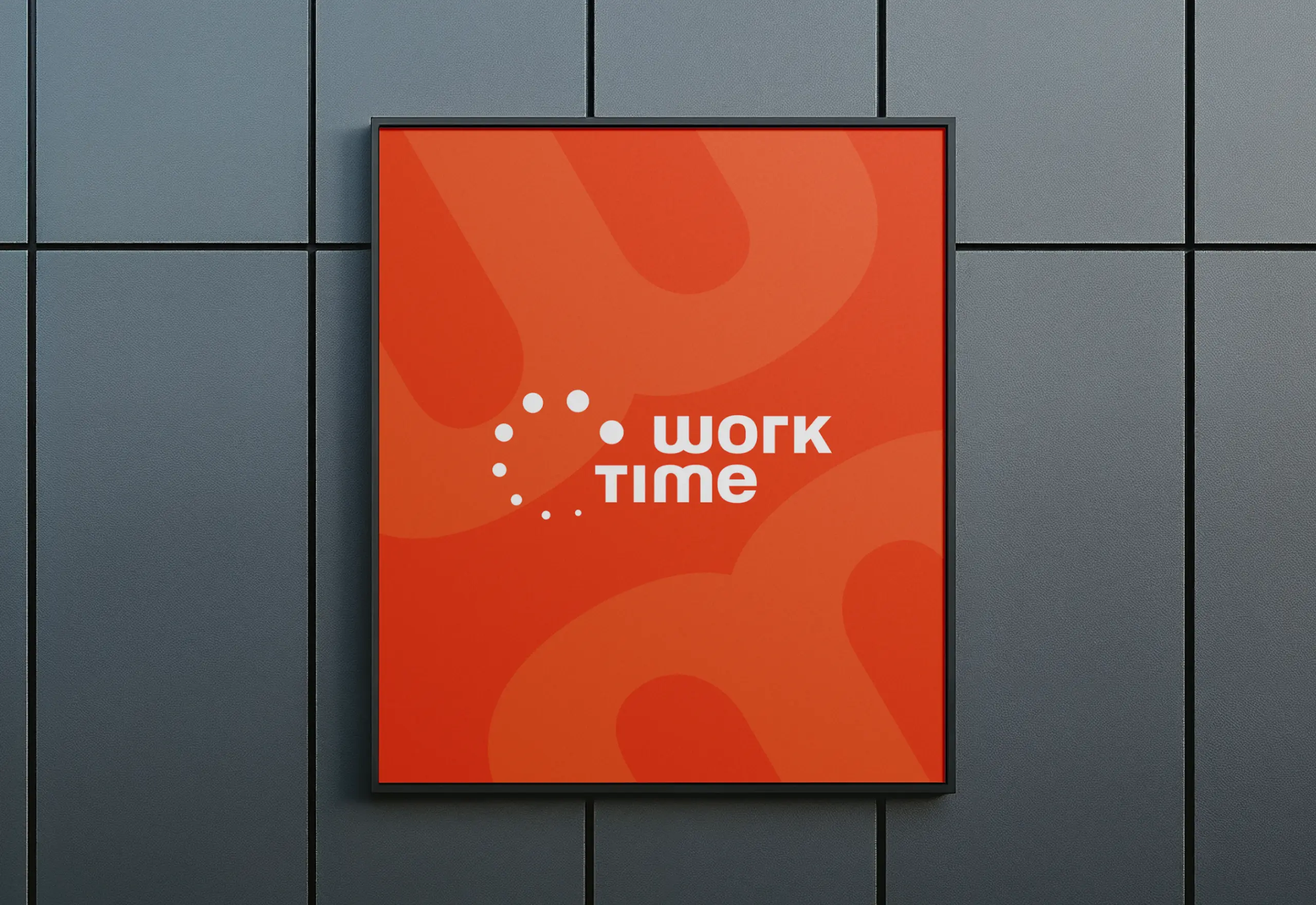
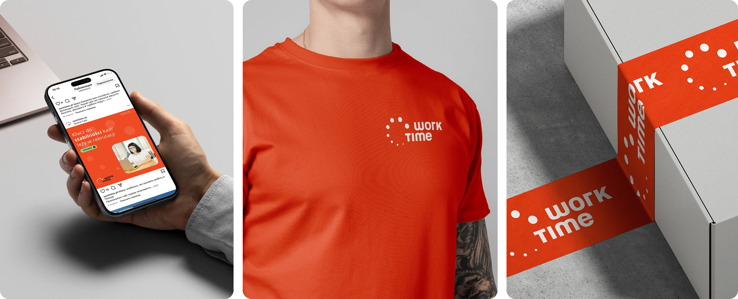
The logo was built around a bold, custom-drawn wordmark — designed to convey momentum and clarity. The symbol reflects movement and coordination, two traits at the heart of Work Time’s daily operations. We developed custom typography and a visual system that includes templates for social media, branded documents, and other materials. The result is a brand that feels both modern and human — easy to use, easy to trust.
Other works
Our works
Please note that only published projects are visible in the portfolio grid.
Longstory short - Works About Contact Privacy Policy