Redefining automotive brand
Highly bespoke brand identity for relationship lawyers
Redefining automotive brand
Scope of work Brand Identity
Scope of Work Brand Identity, Website
After 20 years in the automotive market, Auto Podlasie has made the decision to undergo a rebranding process to align with development of the network of showrooms and company services.
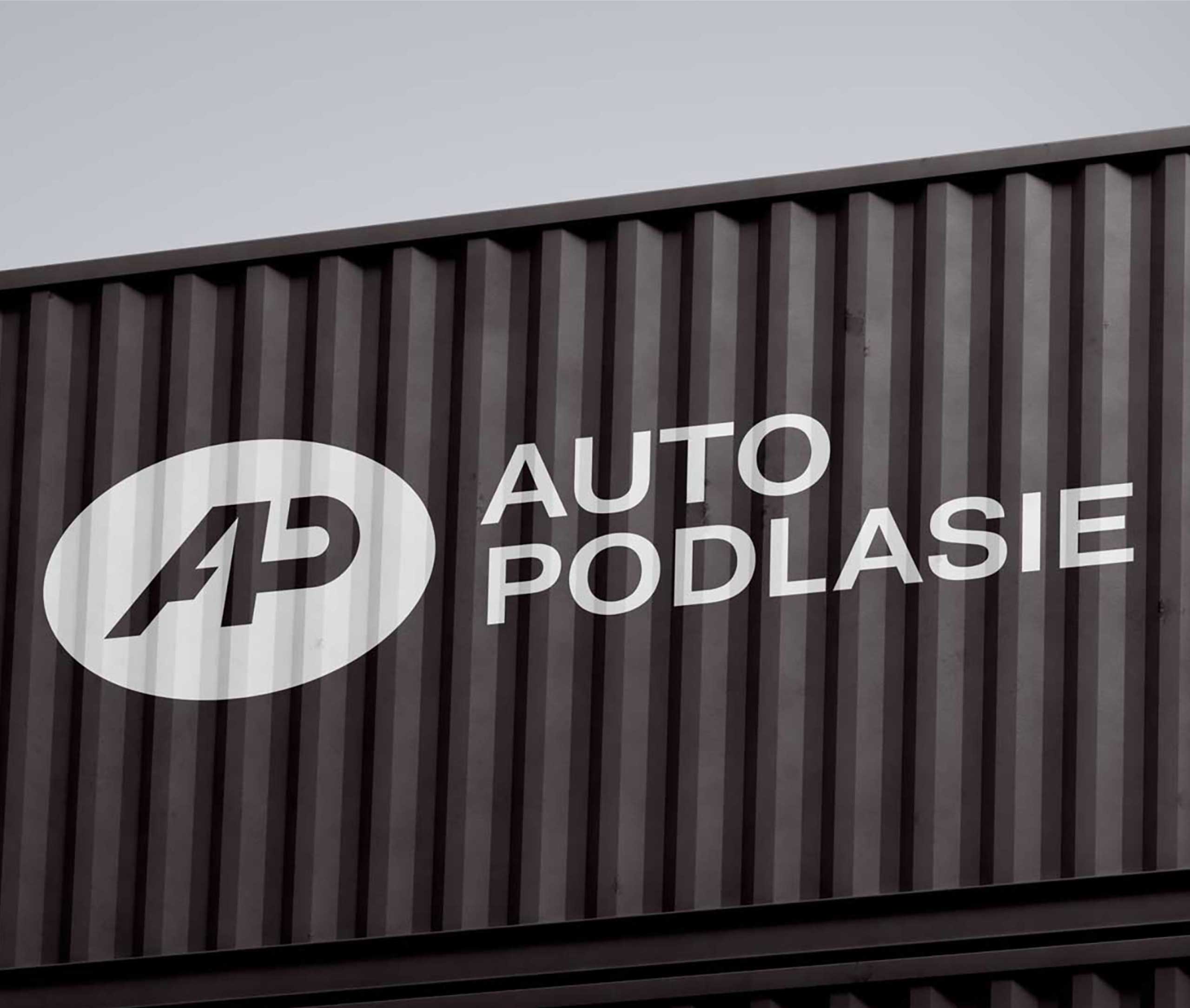
In strategic sessions with a marketing team, we defined brand identity framework. The central message of the Auto Podlasie brand revolves around reliability and the delivery of high-quality services. The brand culture and the rich history of the company are strongly reflected in the final logo.
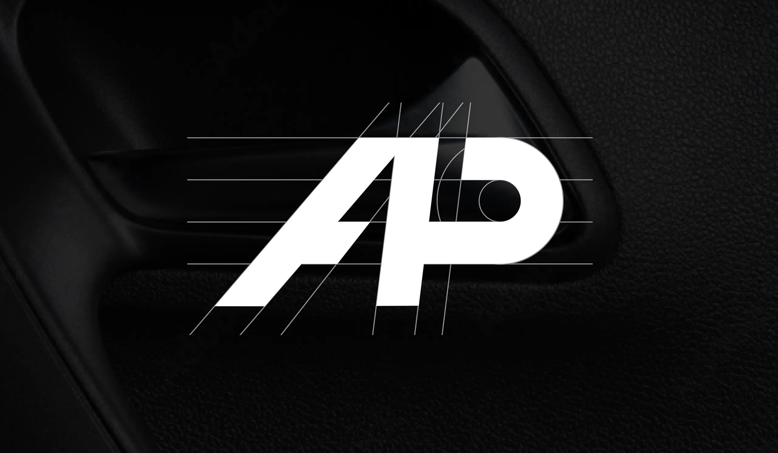
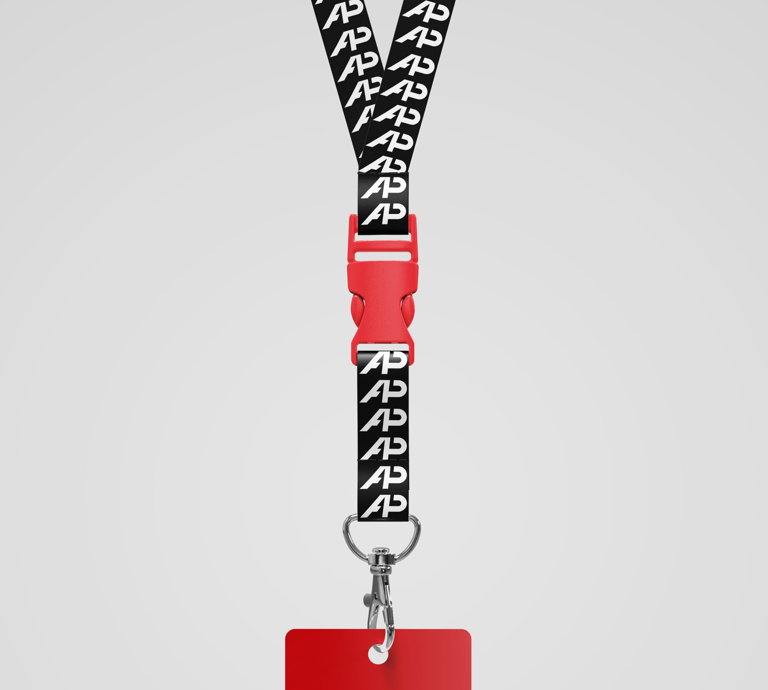
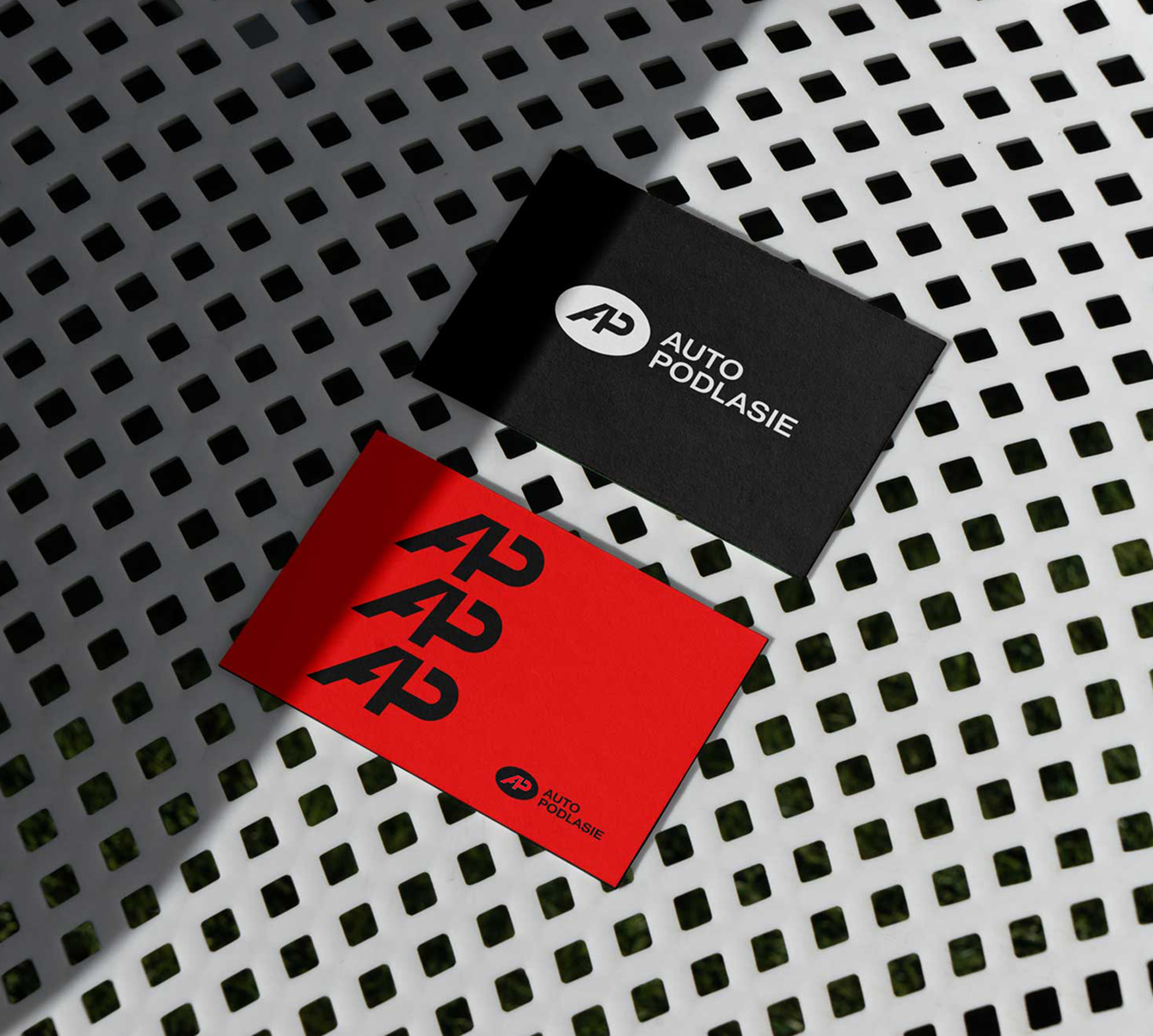
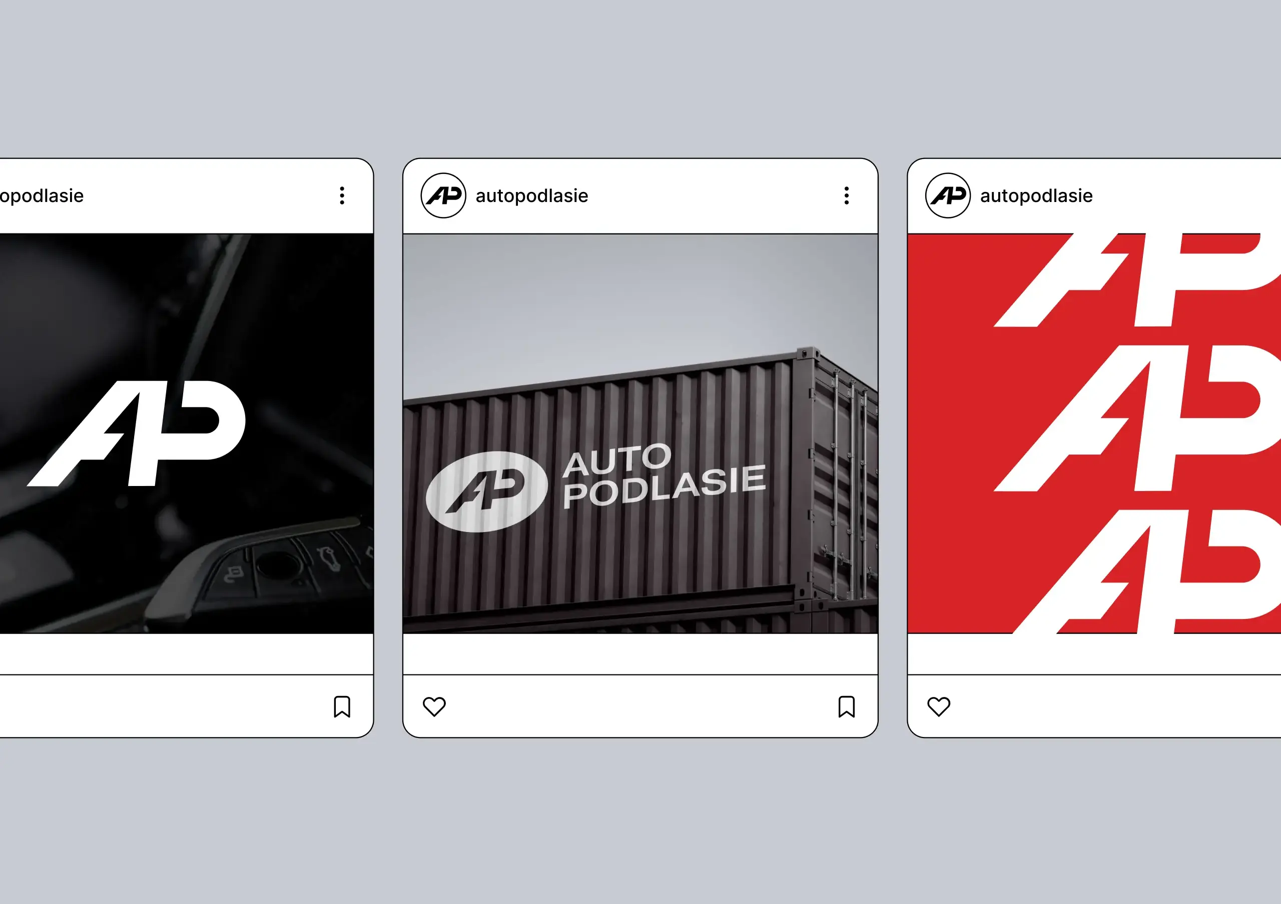
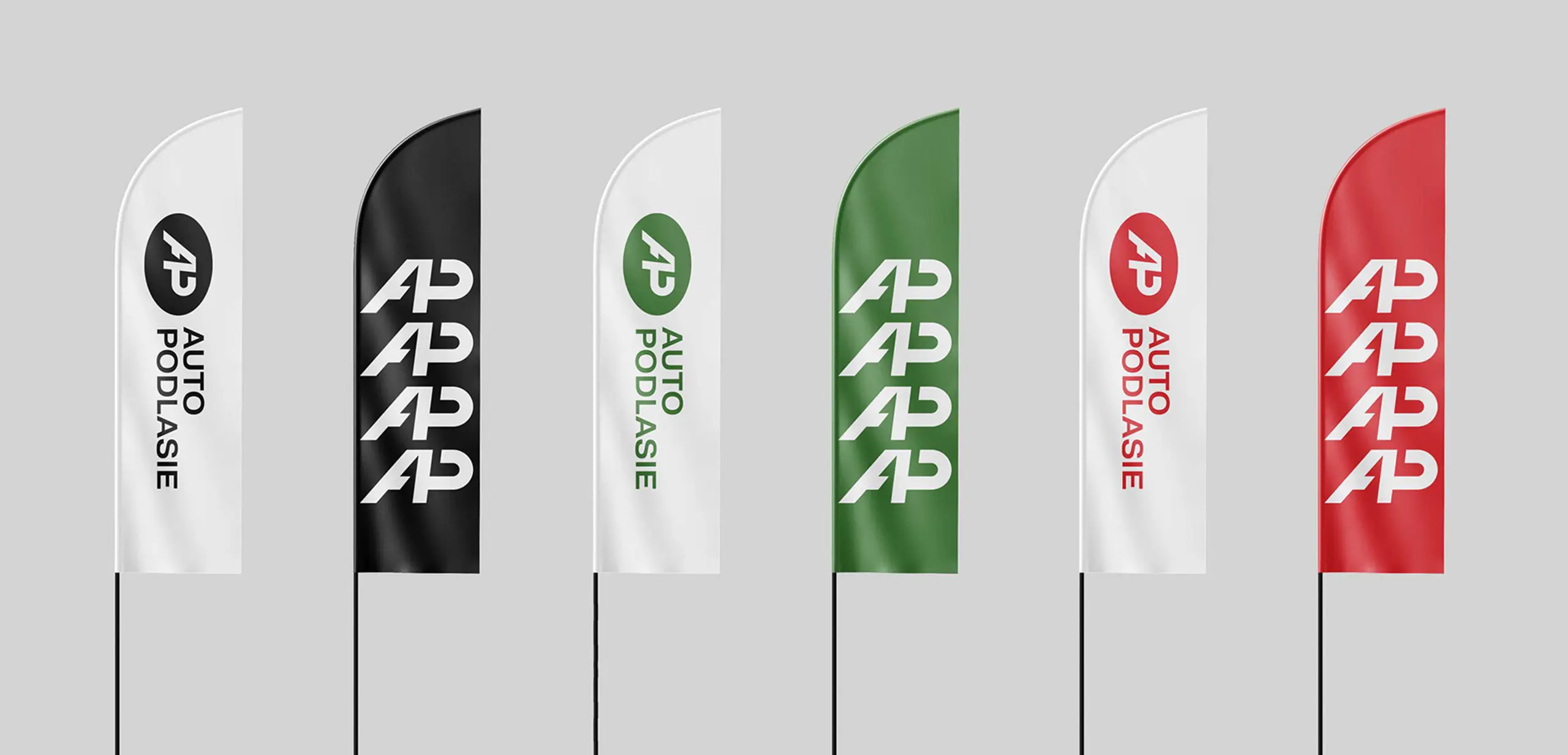
A crucial component of the brand identity is a future-oriented AP symbol. It represents evolution into a provider of digital and mobility services, including a subscription model. To firmly establish the distinctive brand identity of Auto Podlasie, we developed a minimalistic color scheme, based on black, red and green.
A crucial component of the brand identity is a future-oriented AP symbol. It represents evolution into a provider of digital and mobility services, including a subscription model. To firmly establish the distinctive brand identity of Auto Podlasie, we developed a minimalistic color scheme, based on black, red and green.
"Magda helped us go through rebranding process. From the very beginning, the cooperation was at a very high substantive and qualitative level. All in an atmosphere of cooperation, understanding and a lot of positive energy." Kamila Aleksiuk, marketing manager



Design: Magda Paszewska
Presentation Design: Csilla-Cristina Spinochi
Other works
Our works
Please note that only published projects are visible in the portfolio grid.
Longstory short - Works About Contact Privacy Policy