Rebranding of a car fleet management company
Highly bespoke brand identity for relationship lawyers
Sulphur waters medical resort
Scope of work Brand Identity
Scope of Work Brand Identity

AP Flota is one of the first companies in the Polish market to specialize in long-term car rental and fleet management for businesses.
After 20 years in the market, and with a goal to increase activities in digital marketing channels, the company decided to modernize its brand image. During a strategic workshop with the company’s team, we defined the target audience, brand values, and visual direction before entering the design stage.
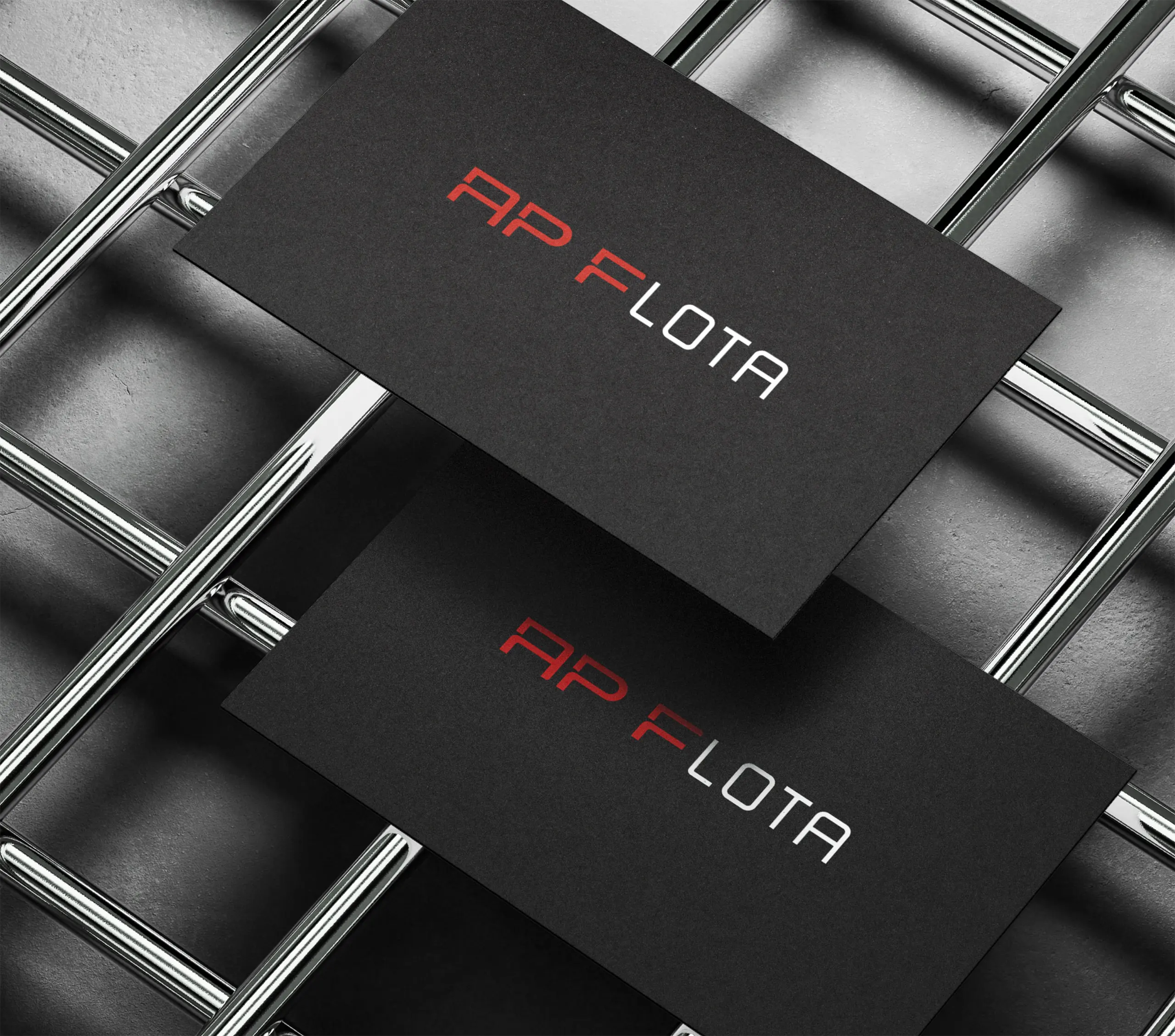
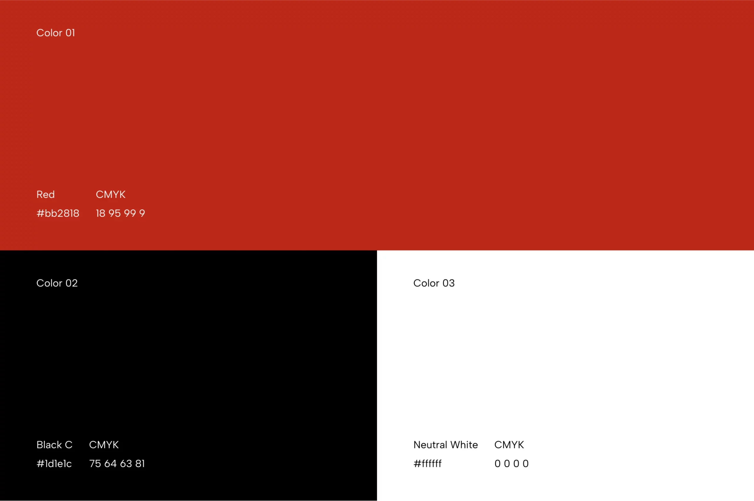
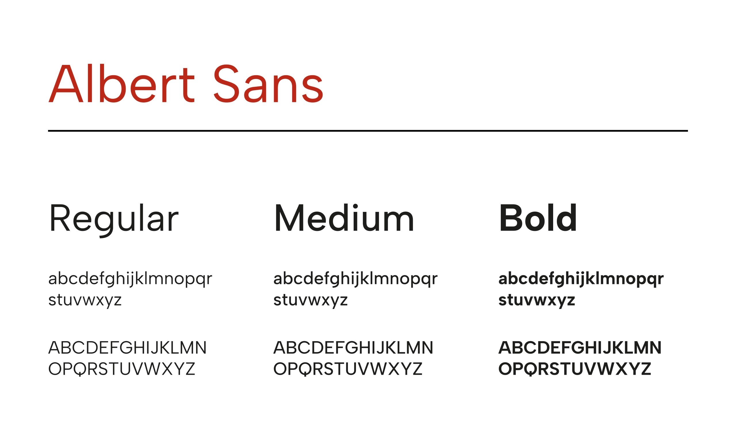
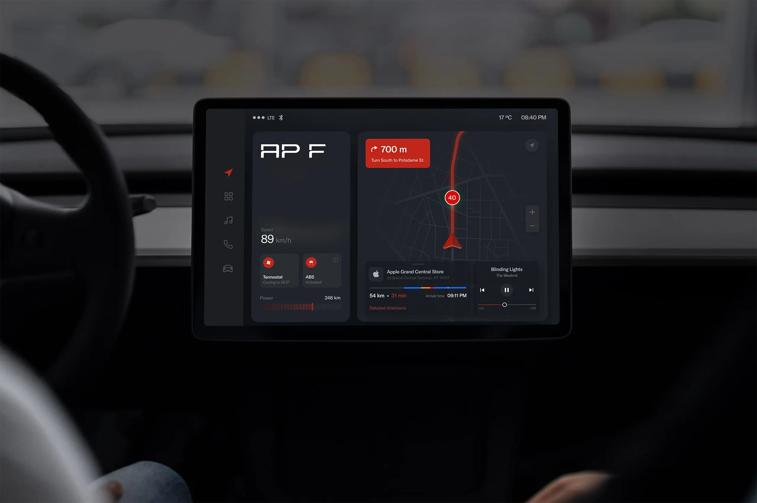
We shifted from using a car symbol to a clean, minimalist wordmark for a fresh look. The typography was updated to a more modern style, while the final design retained the original color scheme to preserve brand recognition.
After the logo was approved, we developed collateral materials, including business cards, envelopes, flags, and office branding. The final step was to create a comprehensive brand book to ensure consistency across all platforms and materials.
Creative Direction: Magda Paszewska
Design: Csilla Cristina Spinochi




Other works
Our works
Please note that only published projects are visible in the portfolio grid.
Longstory short - Works About Contact Privacy Policy