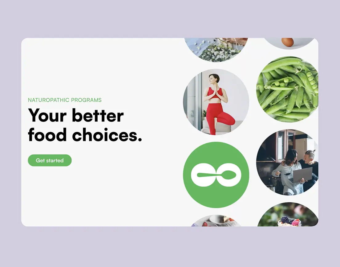
Shaping responsible consumers choices
Highly bespoke brand identity for relationship lawyers
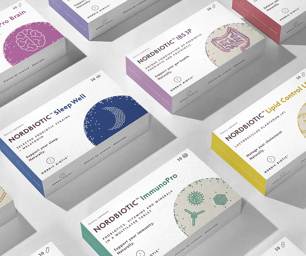
Shaping consumers’ healthy choices
Scope of work Logo and Brand Identity
Scope of Work Brand Identity
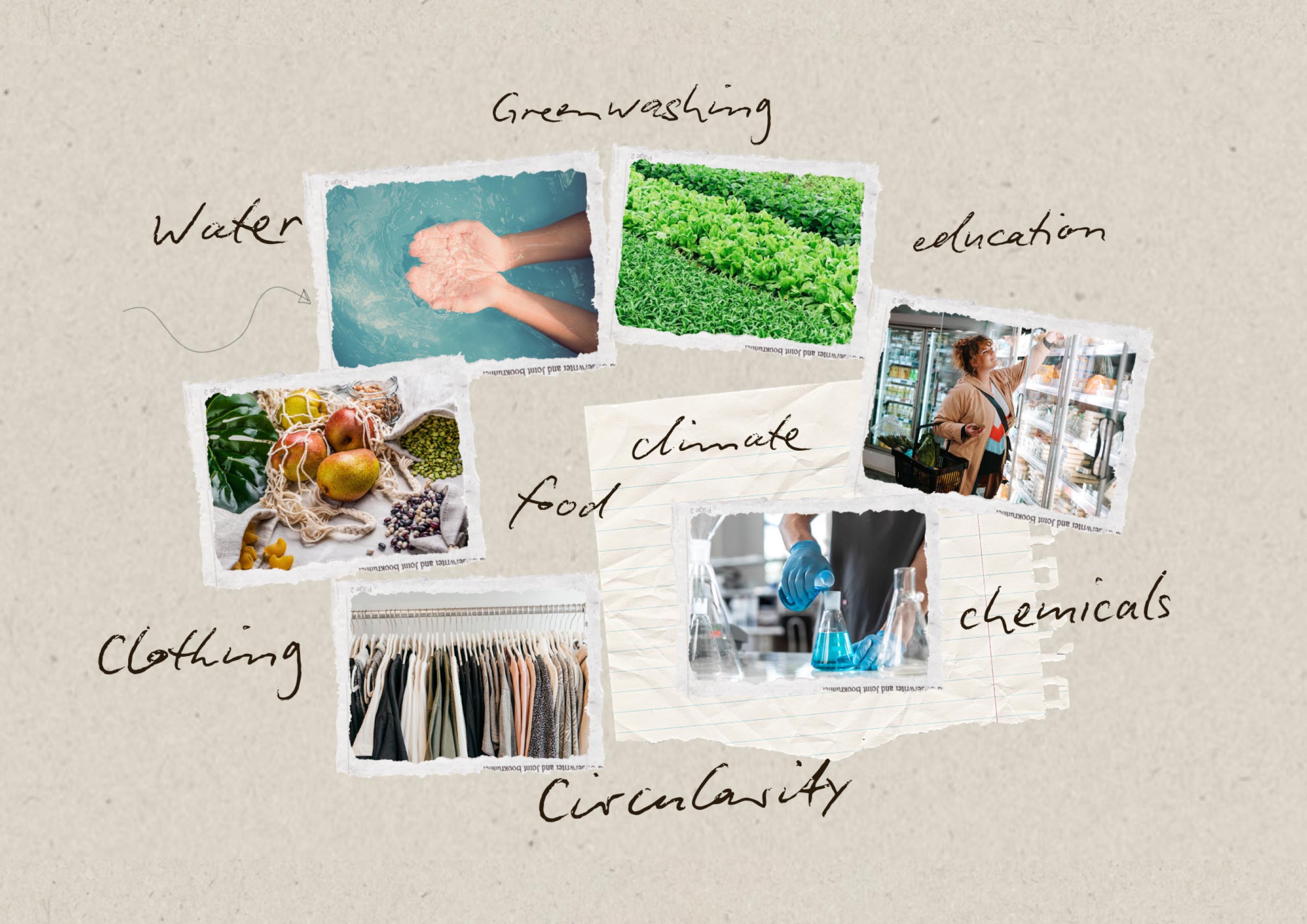
Showing consumers the hidden impact of production on people and the planet, helps them make healthier choices.
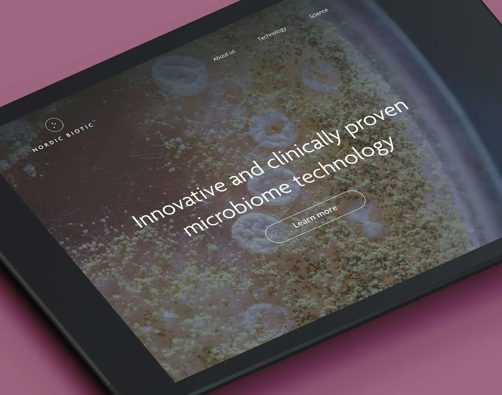
Buy Responsibly Foundation is an organization focusing on responsible consumption and production for over 20 years.
Buy Responsibly Foundation is an organization focusing on responsible consumption and production for over 20 years.
The Challenge
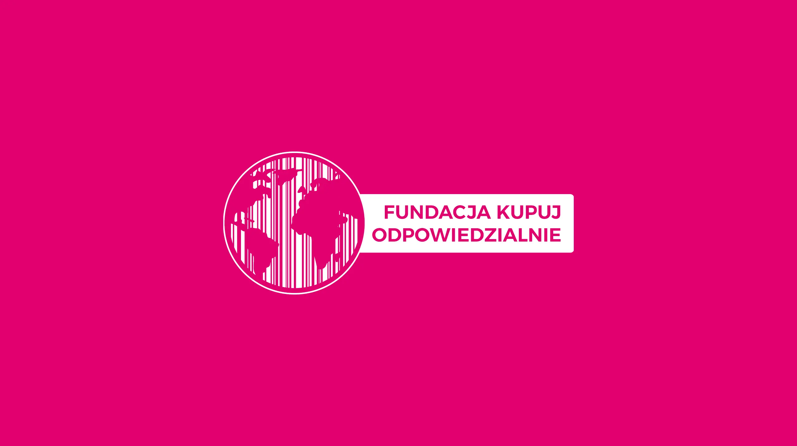
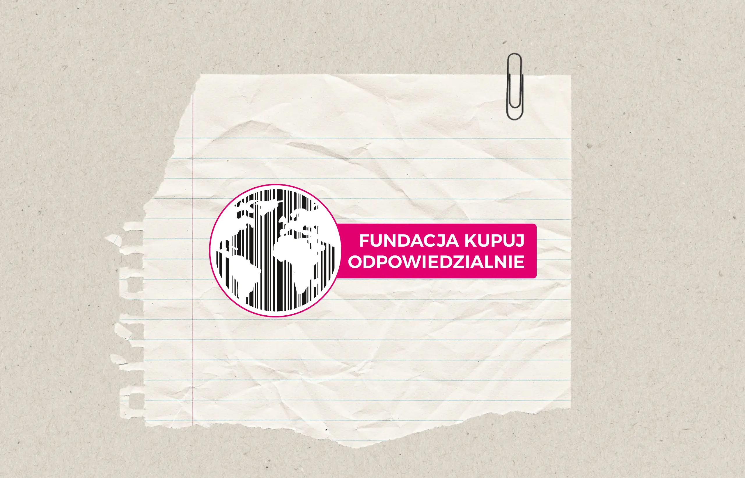
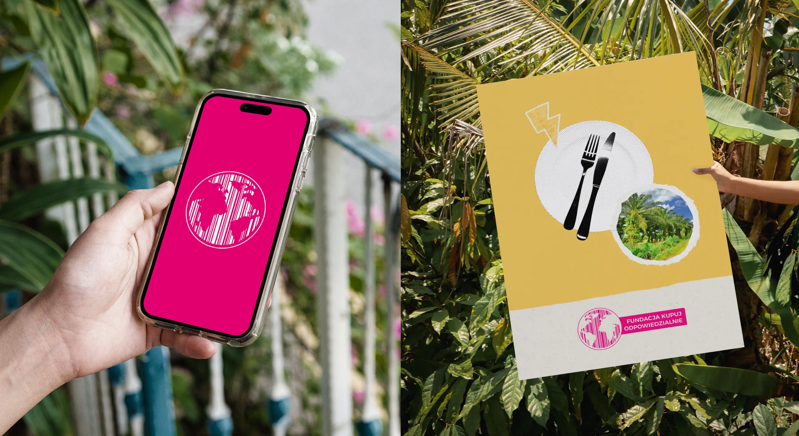
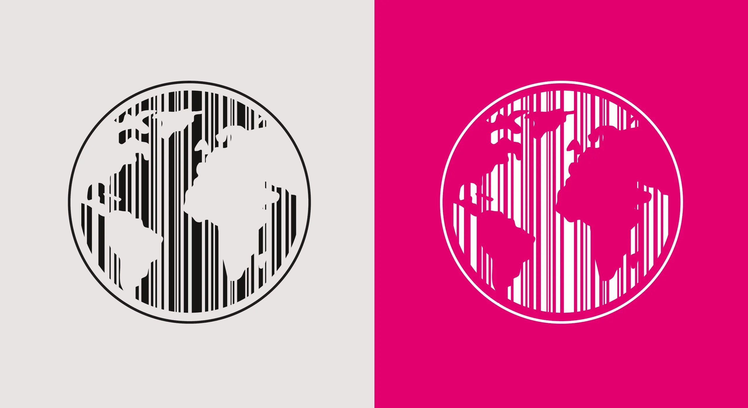
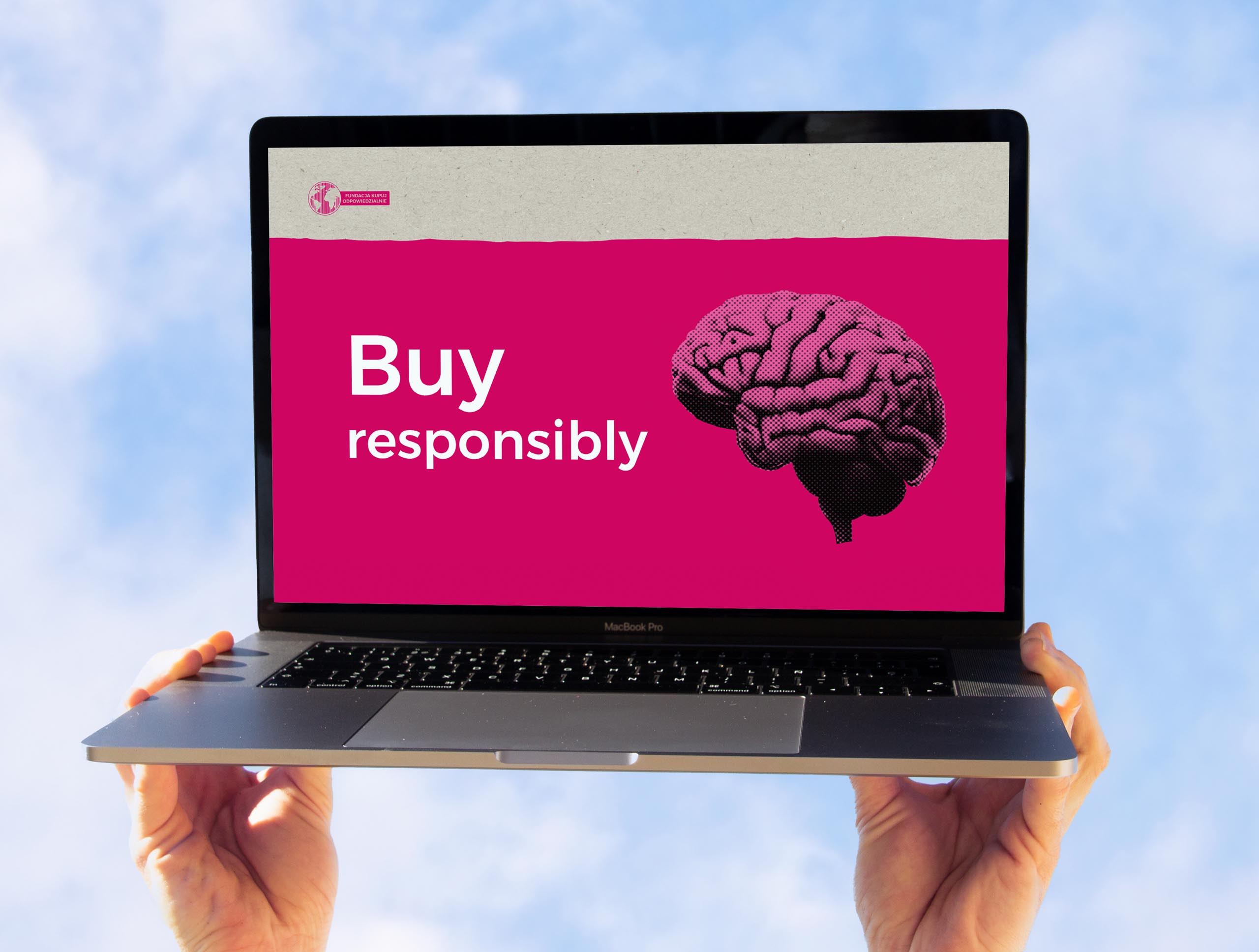
The Buy Responsible Foundation’s logo, a barcode and globe in pink, had been visible in campaigns for a decade. But the system was aging and difficult to apply consistently in modern communication. They needed an identity that could scale—flexible enough for digital media, yet rooted in their recognisable visual heritage.
The Approach
The aim was to keep the recognition earned over the years, while giving the Foundation tools to grow. Our design strategy focused on creating a responsive logo system and a flexible system of visual elements to be used in communication and brand materials.
The Solution
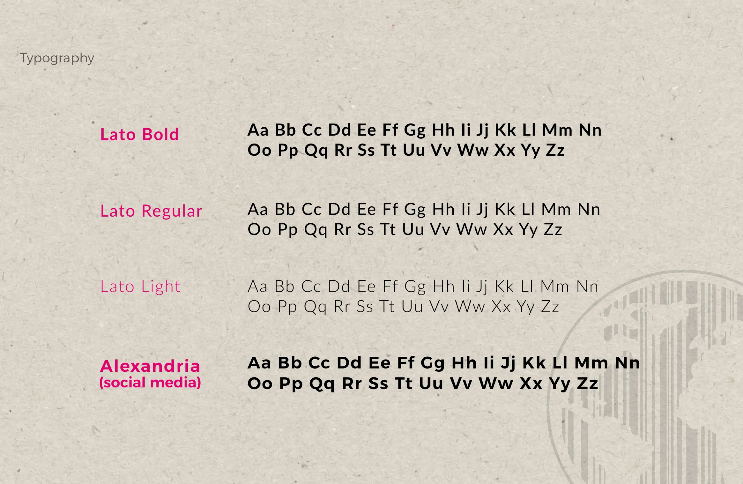
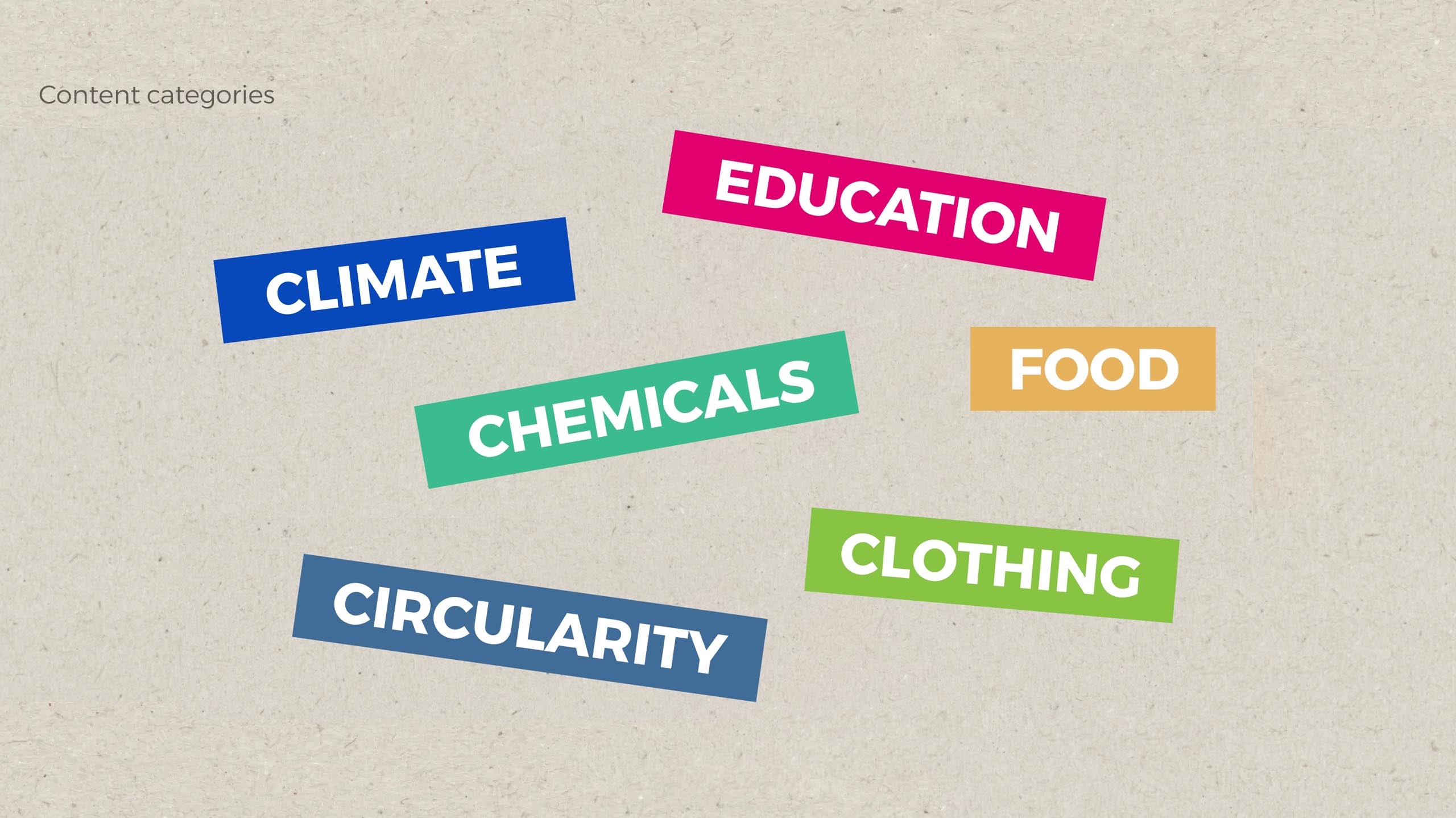
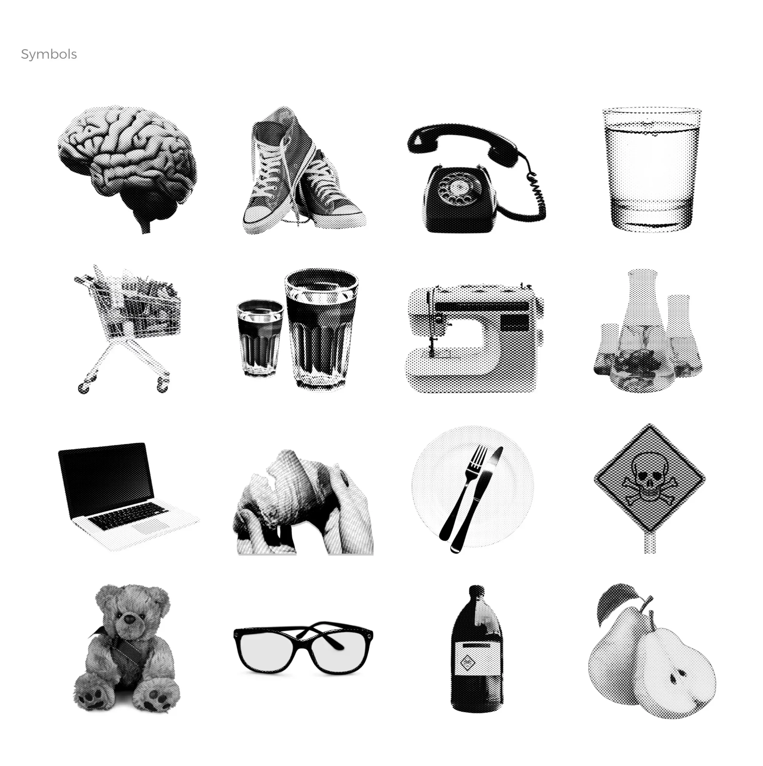
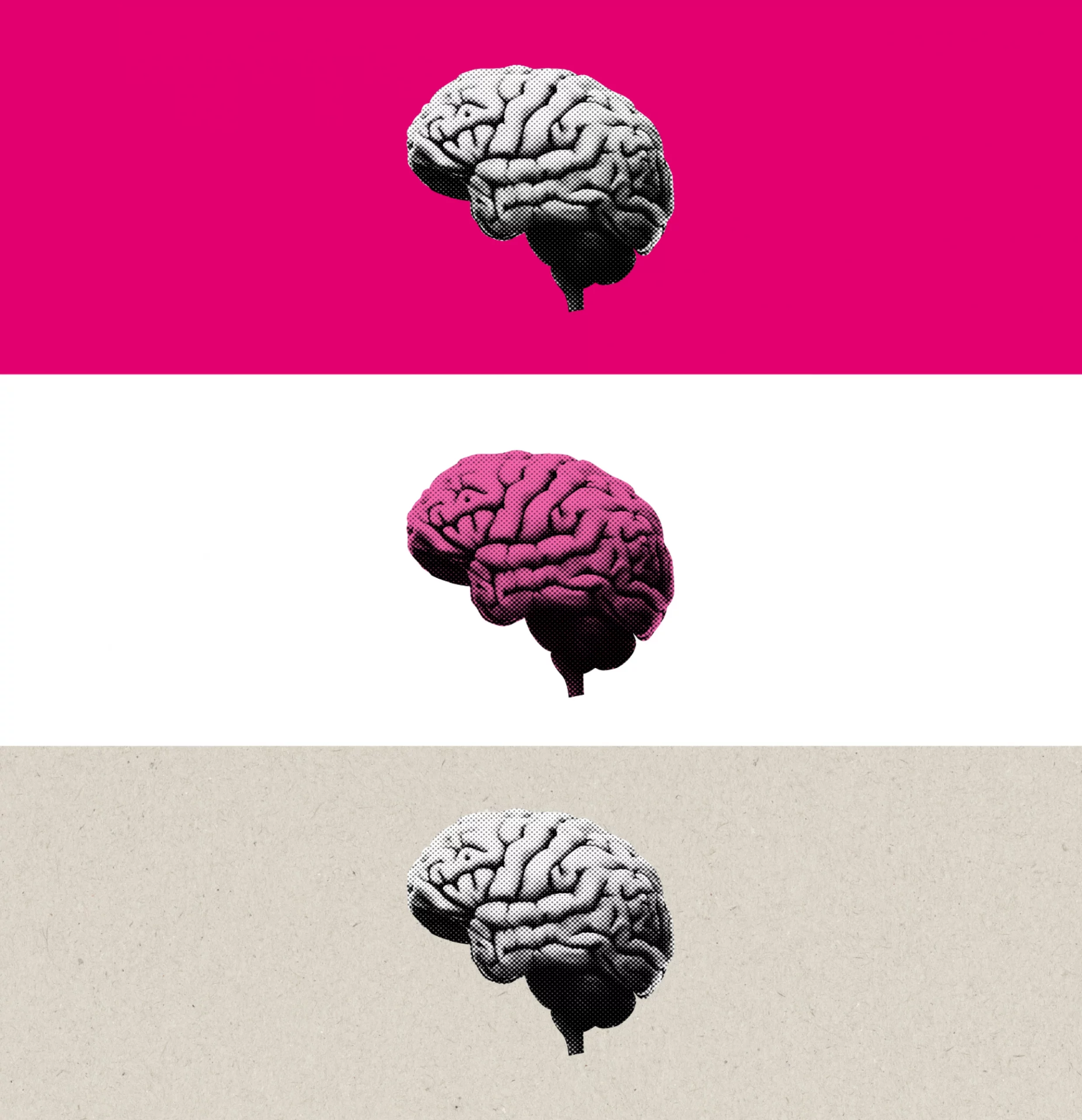
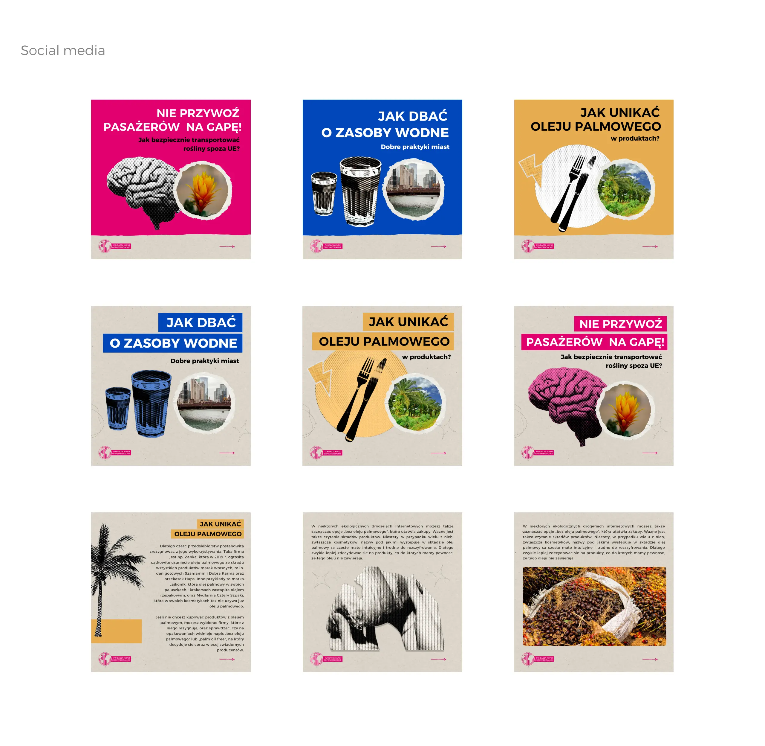
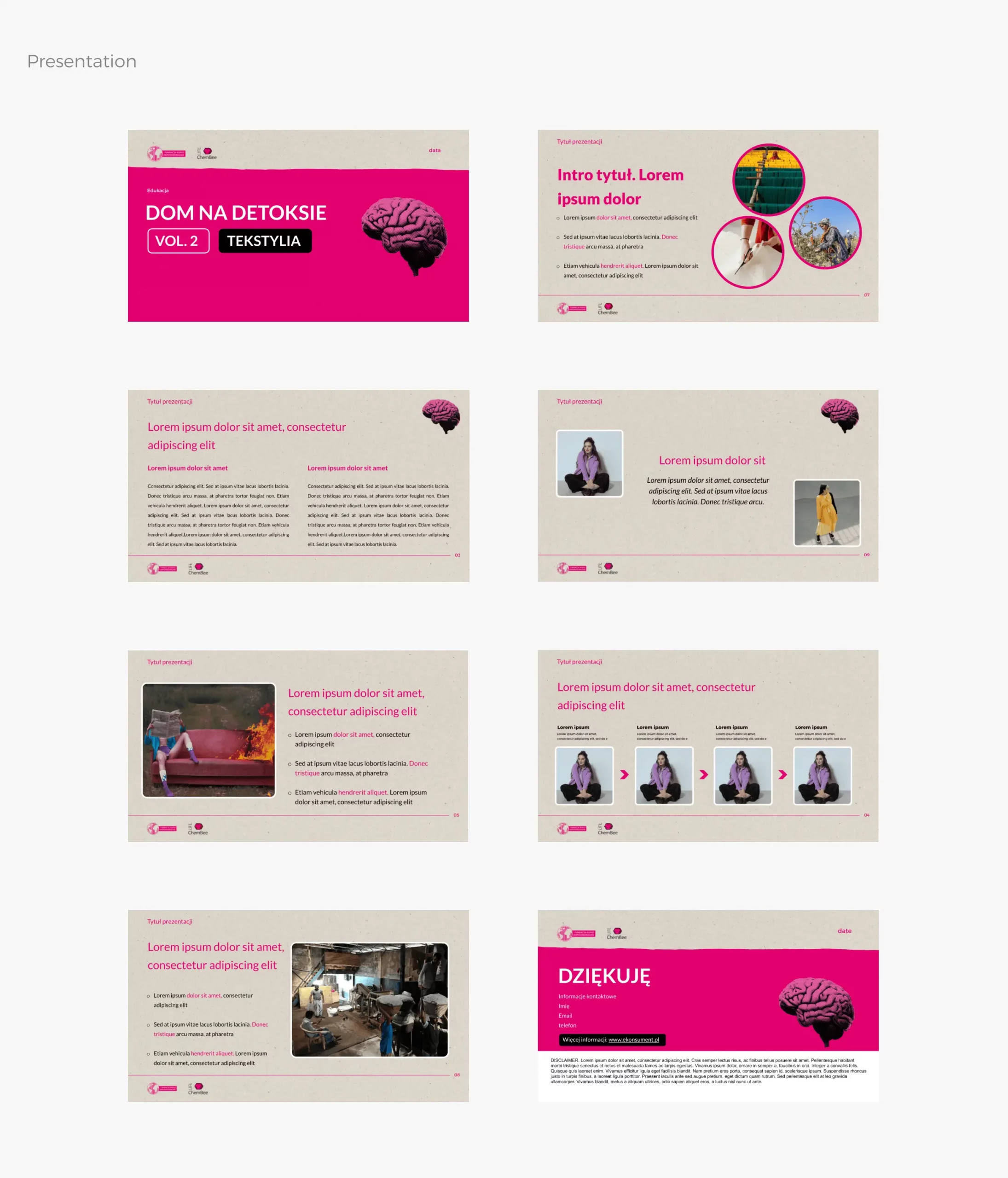
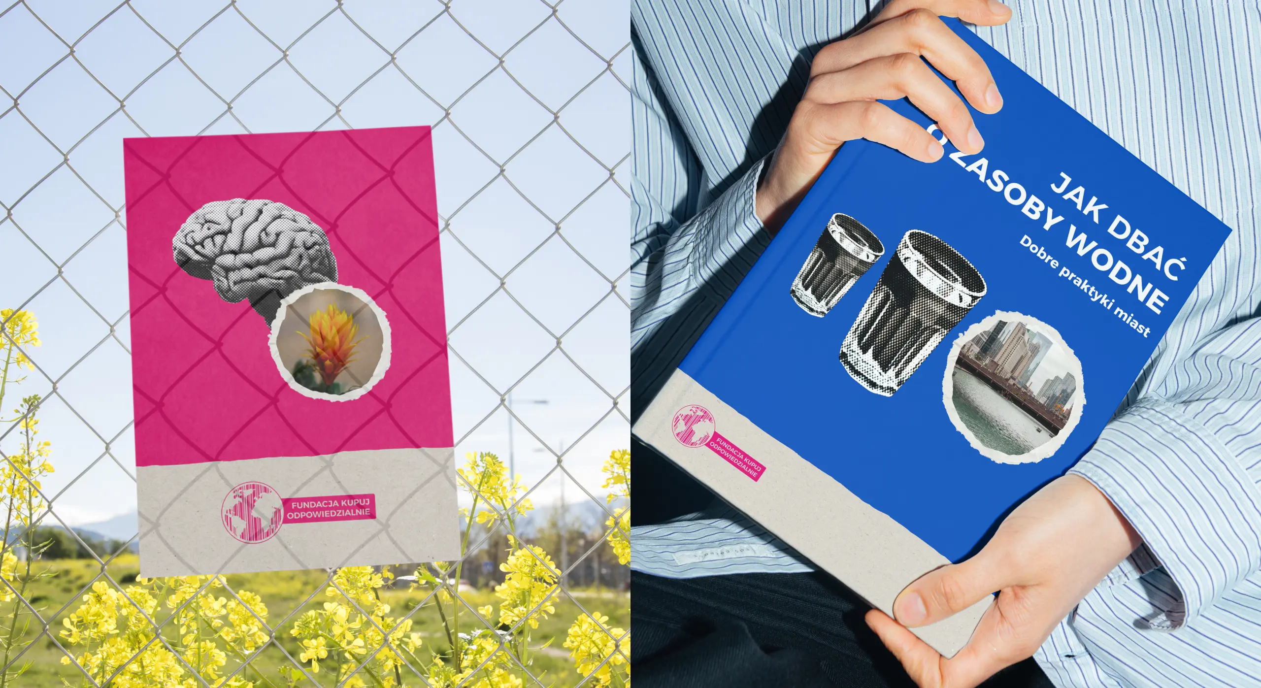
The new logo keeps the story of the barcode and globe but is a compact symbol optimised for profile images and digital presence. The identity system uses a library of symbols and colors that can be endlessly combined, giving the Foundation the freedom to highlight topics without losing cohesion. We also designed key collaterals, from presentations to templates, to ensure the team could apply the system independently across campaigns and partners.
Other works
Our works
Longstory short - Works About Contact Privacy Policy